This is the album cover for Frank Oceans 'Channel Orange', I like this design as the overall design is very simple. However, its simplicity is very appealing. I also like the minimalistic approach towards the design, as in this modern day and age what seems to be the case is 'less is best'. So this 'motto' has influenced this directly as there is only the very important things shown in this cover. I like the fact that Frank Ocean himself is in an orange tint and the whole cover is in an orange tint. This is the sort of style I would like to implement on my own album cover.
Here, Chris Brown's album 'Fortune' and Drake's latest album 'Nothing Was The Same' is also loosely based on the same idea of 'less is best' as they have they again have the bare minimum items on the cover. These generally seem to include the artist covering most of the cover and the writing covering the rest of the cover.
Ideas For Artist Name
Paul Collins
Sam Ford
Eric Fuller
4-Bz
Just Dave
Having conducted the survey the different names that has been chosen by my target audience is that 'Just Dave' seems to be the most popular. I like this name because of its simplicity. I think this is why it sticks with the audience and why my target audience liked it. Ideas For Album Name
In Case You Didn't Know
Magician
Born Sinner
Lights
Night Vision
Again, conducting a survey with my target audience the most voted for the album name is 'In Case You Didn't Know'. Many said that this works well with the my chosen artist name 'Just Dave'.
The stage is where the majority of my music video is going to be filmed. This is because this is the easiest location for me to incooperate the specific lighting I need to carry out the ideas I have for the music video. It also has a somewhat reflective wooden surface meaning that the red candles can reflect more light, this would mean that I don't need to think about a way to include more natural low key lighting. It is also big so I have a lot of space to manouvere and incooperate a variety of long shots.
The field is going to be used everytime the chorous comes on. This will be high in natural lighting. This is so the actor can be walking while lip syncing to the song and can look like the actor is going to try and copy the 'essence' of emotions portrayed by the original artist in the song.
This is going to be my actor. I have chosen him for this because he is young and also tall (I need this so it will be easier for me to in cooperate the use of the spot lights and other tools). This will really add to the personality of the song. They will represent my artist well as my artist persona is open, friendly looking, good looking, caring. This means that he will fit perfectly into my artists image as he fits the artist persona. I also need someone confident and someone who doesn't shy away from the opportunity of getting filmed. This is important as my entire music video is based on the artist. He represents my target audience well with the listed qualities so he is easily relatable to my target audience age of 16-25.
Having recently been shown this music video, I have been left in awe of the concept behind the video with projection of different lights and designs; all done on a face. I think this style would fit perfectly into my music video, however the time and effort means that I would possibly not be able to in cooperate this into my work. I will although try to add in some sort of projection based from this video.
As mentioned before I would like a very dark room with a spot lights to highlight the mood of the song. As well as spot lights I would like to use different types of coloured lighting to highlight the actor. I would also like to add a very midnight blue tint to the music video in order to create a very sadistic atmosphere which would go hand in hand with the song.
Overall, I want my artist to look like the image below except with a dark red shirt. This is so that they fit with the colour scheme red and blue. They will be wearing high tops, with black sunglasses and a black watch. I am getting a hold of this through my own wardrobe.
Props
White iphone headphones are also going to be used while my actor is in the field while lip syncing to the song. I own this so it won't be hard to come across.
Looking at different adverts for magazine adverts, the most common thing is that the picture takes up more than half of the advert with the title shown very explicitly. The pictures are often eye catching, most adverts tend to not use a picture of the artists themselves but a digitally created image of the album they're advertising. At a glance, most of the adverts provide little clue to what genre the artists belong to. However, once you start looking at adverts from different genres the genre becomes somewhat clear, that is if you don't already know the artists/bands. What I mean by this is that the pictures used on the adverts normally give away a clue. However, the typical conventions seem to be there is a clear artist name, album name and the date of release which goes hand in hand with an eye catching image which can be either digitally created or be of the actual artist. This immediately gives us the basics for creating a magazine advert, however there are other extras in most of these adverts such as websites to interact with the fans and getting previews and downloadable content. Some artists/bands have a specific font and/or logo attached to them which is also added to the advert which makes it clear who the advert is for. A less typical thing is for record labels logo to be imprinted on a corner of the advert but it does feature in some of the adverts such as PJ Harvey, Kings Of Leons.
Dizzee Rascal has come up originally in the grime genre, meaning he has always been a bit ‘out there’. This is reflected in his CD cover, it’s very bold and colourful, much like how he raps. It also gives off an energetic vibe as the cover has bubbly writing along with Dizzee sat on some drawn on rocks. You can also guess the sort of music genre that he’s involved with; rap. The style and layout of the cover clearly links with his bubbly target audience (roughly 13-20 year olds). Carrying on to the inside of the front cover, the list of songs also carries on the bubbly font from the cover showing no change. The colours used itself are very bright and simple, the whole CD cover only uses 4 colours which are mostly variations of blue and red. This could represent men and women and could be using simple colours to reach out to both genders at the same time.
Dizzee Rascal - Tounge Cheek
On the back of the CD cover, it’s the same story and there are no changes within the colour scheme. However, the list of songs take up more of the cover this time. It also features the common things you find on the back of a CD including a barcode, the record label and various other logos.
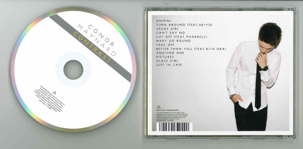
Connor Maynard - Contrast
Wither Connor Maynard, the booklet cover and back are similar like Dizzee Rascal's CD. Connor takes up the majority of the front cover and a significant amount on the back while sharing the space with the list of songs. He is a young and new artist so we can see his face quite clearly. The background is white, which could be indicating his 'pureness' and innocence. This would appeal to the target audience as it shows Connor in a good light and also keeps the focus on him. He is dressed like a typical 'trendy' teenager with a leather jacket in one and a shirt and tie with red shoes in the other. This shows he can be serious but can also be playful as he is only a teenager and still has time to mature. The addition of his name and album name on the front in a sort of black transparent banner makes the whole case look a bit stylish and modern. His name is in white while the word contrast is in yellow. This literally makes the word 'contrast' contrast against the main colour of the case; which is predominantly white.
Connor Maynard - Contrast
The CD design in plain terms is quite simple and bland. However the edge of the CD has a ring of different colours which makes the CD look classier. This goes well with the white background but the colours within the ring contrast wiith the predominantly white CD. Again there is a similar banner across the CD however this time it is only the word 'contrast' in a banner of a dark gray. The artist name is listed above the banner in a lighter gray. Typical of a CD, it also carries a logo and the relavent print of the credits and record label. However this is wrote in much smaller writing as to not take the credit away from the artists name and album name.
The back of the album runs with the same predominantly white theme. Again Connor takes up most of the space available but the list of tracks in the album are clearly shown in plain black. This works well against the white background. Connor is also wearing a white shirt with black trousers and a black tie, as if to subtly say contrast as black and white contrast against each other. On the bottom left of the CD, there is a typical barcode, credits and record label information but again like on the actual CD it is in much smaller writing as to not take attention from Connor himself.
Plan B - Strickland Banks
At a first glance, the first thing you see is that the whole CD booklet is in black. This helps in keeping the attention on Plan B and the title, which is in the style of an old movie theatre. On the left, there is a black and white picture which looks like it has been taken using a spot light in a dark room making him really stand out. This combined with his pose, in both pictures, makes it seem like the genre of the music will be along the lines of slow, sad songs. A slightly different in the pictures is that Plan B's face isn't very clear, however, they can get away with this as Plan B is an old, established band compared to Connor Maynard where his whole face is shown in every picture on his album 'Contrast'. The main colour scheme, black and red, again works well with the poses of the artist so gives a definite vibe of an emotional artist.
Plan B - Strickland Banks
asdAS
Looking at the CD, it looks like an old vinyl record. Which stays with the classic theme, matching the old thatre in the booklet. This could also be an indicator that the target audience is slightly older than normal as there is a lot of old fashioned influence in and around the CD. All the typical information is located in the inner circle which is in a very simple black, which does not draw much attention to itself meaning that the main focus is the actual design of the CD.
Plan B - Strickland Banks
Again, moving on to the back of the booklet, it follows the theme of old fashioned, showing the names of the tracks in the style of old movie listingings in old theatres. It is again, in black and red with a white background for the main listings. As most CD's, the barcode and credentials and record label information are written in small writing on the bottom left and bottom right.
Ideas Gained
The main ideas that I have gained by analysing these digipaks and others is to keep the whole design consistent using the same fonts throughout the booklet with the same background colours. It also has to have a unique eye catching appeal such as bubble writing and unusual locations. Try to represent the genre of the artist while thinking about what colours and pictures to use. The last, to have the track list cover most if not all of the back part of the booklet with legal information written in very small writing in the corners so not to pull attention away from the main design.
Having looked through and analysed music videos, they all seem to have somewhat of a correlation with the lyrics even though it may not be clear all the time.
I want my music video to be performance based so the shots are mainly going to be focused on the artist.
I'd like to incorporate a lot of long and mid shots in my music video along with a lot of low key natural lighting with clouds of smoke produced with the use of a smoke machine. I would like shots to be cross cut This would be filmed in a dark room. I would like the artist highlighted with a spotlight like on a theater stage. I would also like the artist to be surrounded by red candles as red is associated with love which is what the song is predominantly about. This will flow with the mise-en-scene as the artist is going to be mainly be wearing black and as the artist is going to be wearing sunglasses so this will represent a mystery as we can't see their eyes. I do not want to add in any significant editing apart from the midnight purple tint to the video.
The artist is going to be lip syncing to the song the whole way through the music video so I want to in cooperate a lot of mid shots and medium close ups. In terms of cinematography, I will use a panning shot with a long shot to establish my location in the dark room lit with different colours of spot lights. Close up on various parts of the artist to show their watch, shoes and casual suit. High angle shots are going to be used so the audience can see the whole of the artist in a 'comfortable' way and also make him easier to see as the artist is still up and coming. The transition of shots are going to be straight after one another, this is also going to change along with the beat to add a real connection between the music beat and the music video.
This music video is going to meet some of the genres conventions such as flashy clothes and that the music video is performance based and also include flashy cars. Unlike the general convention of hip hop I will not be sexualising women as this is a song about one.
Having gone through my possible song choices, I have decided to choose this song because I really like the song which I feel is important as I want to feel a close 'connection' to the song so it is easier and worthwhile for me to create a music video with my own ideas.
The song overall is quite a slow song where Frank Ocean is singing about one person missing another. I feel like this would be a perfect song for me to base my music video on as I am very interested in working with shadows and low key lighting as I like the theme of mystery/darkness and this fits in with the mood and atmosphere that the song creates.
Frank Ocean
Lyrics
A tornado flew around my room before you came
Excuse the mess it made, it usually doesn't rain
In Southern California, much like Arizona
My eyes don't shed tears, but, boy, they bawl
When I'm thinkin' 'bout you
(Ooh, no, no, no)
I've been thinkin' 'bout you
(You know, know, know)
I've been thinkin' 'bout you
Do you think about me still?
Do ya, do ya?
Or do you not think so far ahead? (Ahead)
'Cause I been thinkin' 'bout forever (Oooh)
Or do you not think so far ahead? (Ahead)
'Cause I been thinkin' 'bout forever (Oooh)
No, I don't like you, I just thought you were cool
Enough to kick it
Got a beach house I could sell you in Idaho
Since you think I don't love you, I just thought you were cute
That's why I kiss you
Got a fighter jet, I don't get fly it, though
I'm lyin' down thinkin' 'bout you
(Ooh, no, no, no)
I've been thinkin' 'bout you
(You know, know, know)
I've been thinkin' 'bout you
Do you think about me still?
Do ya, do ya?
Or do you not think so far ahead? (Ahead)
'Cause I been thinkin' 'bout forever (Oooh)
Or do you not think so far ahead? (Ahead)
'Cause I been thinkin' 'bout forever (Ooh)
Yes, of course
I remember, how could I forget?
How you feel?
And though you were my first time
A new feel
It won't ever get old, not in my soul
Not in my spirit, keep it alive
We'll go down this road
'Til it turns from color to black and white
Or do you not think so far ahead? (Ahead)
'Cause I been thinkin' 'bout forever (Oooh)
Or do you not think so far ahead? (Ahead)
'Cause I been thinkin' 'bout forever (Oooh)
As a means of exploring my target audience, I set out surveying males and females of 13-20 year old's a set of questions relating to what type of music videos and genre they like to watch on a regular basis. Here are the questions listed below and their answers. Target Audience Profile: -Males and females -16-25 -Interested in hip-hop and rap -Doesn't mind listening to other genres -Student -Most like has a job -Interested in gigs -Likes new artists -Sociable -Spends free time looking for new music
Gender Male - 20 Female - 18
Preferred Genre Hip-Hop/Rap- 14 Pop- 7 Indie/alternative- 9 Rock-2 Alternative Rock-0 Country-0 Grime-0 R&B-6 How Often Do You Watch Music Videos? 1-4 a week - 12 5-7 a week - 16 More than 8 a week - 10 What Do You Look For In A Music Video? Story - 4 Artist Based - 15 Location - 3 Clothes/mise-en scene - 7 Editing Effects - 5 Choreography - 4 Which Of These Three Types Of Music Video Do You Prefer? Performance Based - 14 Concept Based - 8 Narrative Based - 2 Evaluation Having surveyed my target audience, I have come to decide upon a performance based music video because this seems to be the most preffered within my target audience with a heavy focus on the artist and mise-en-scene.